mfa journal

Dante, misery, coincidences

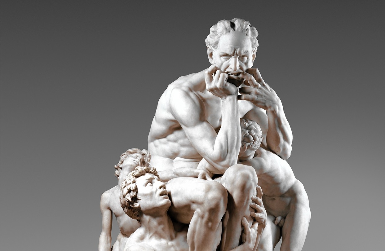
At my latest visit to the Met I was really struck by the intensity of the sculpture titled Ugolino and his Sons. It is inspired by the character Ugolino in Dante’s Inferno (which in turn was inspired by a real man in 13th century Italy), who is found guilty for treason and betrayal, and imprisoned with his sons and grandsons and left to starve. The placard describing the work takes it a step farther, positing that Ugolino had to decide between starvation and cannibalism — upon looking into this further, I learned that particular angle came from Dante himself.

Dante’s Inferno has been particularly relevant to me lately because this same week, I also signed on to an RA position where we are working on an exploratory project about that very same poem. I’ve been trying to explore creative ways to think about Dante’s work and the underlying themes in these verses, so randomly being drawn to this sculpture was a serendipitous moment.

What impacted me most about this sculpture is how Ugolino is depicted with such profound consternation and misery. Then I realized so many of the other sculptures I was drawn to were similarly grief-stricken in some way. The other most striking sculpture to me was titled The Martyr, depicting a woman lying in a precarious position, almost as if her body was flung there. From the Met’s website,

Rodin depicts the young woman posed in an attitude of death: her supine body twisted, legs crumpled, head thrown back, and arms outflung. Splayed upon an altar-shaped pedestal, she becomes a symbolic martyr to humanity’s shared fate. Her youth evokes death’s universality, her nakedness its indifference, and her isolation the loneliness of the final struggle.

Last semester one of the core maxims in my CPS manifesto was “design for emotional resonance.” These pieces really remind me of that power. Honestly, while my current MS2 project can appeal to emotion, I definitely made the decision to put pathos on the backburner this semester – I’m glad I did because I’d like to try out as many different angles as I can while I’m here and figure out what I really stand for as an artist. So far, I think the things I care most about are: emotion, beauty, truth.

The only rule is work

“If you work it will lead to something, it’s the people who do all of the work all the time who eventually catch on to things.”

Scrollytelling progress

Yesterday I added the outline that I wrote and researched and I figured I could also keep a running document of the building of the website so far. To be fair, this doesn’t take into account the entire D3.js setup I had for the force-directed graph with nodes representing people and events in computing history, which was prototype 1? 0.5? But I’ve scrapped that prototype in favor of this scrolly storytelling approach, which appears a whole lot simpler to people but is really pushing the limits of my coding capabilities, even with the help of AI. It’s really making me reconsider my decision to make my project more meaningful at the expense of it seeming less impressive.

  • Translated my script into a code-readable markup language JSON file, with each text element turning into a ‘step’
    • Used ArchieML and Google Cloud APIs authorized client… still confused on this part, might run into issues in deployment
  • Implementing scrollytelling with Scrollama.js and Inspection Observer
    • Event handlers: onStepEnter, onStepExit, and onStepProgress to respond to scroll positions
  • Background image setup with crossfade CSS animations
  • Dynamic image management with an imageData object that associates steps with corresponding images and customized threshold positions
    • handleProgressImages() function evaluates current scroll position against defined thresholds
    • DOM manipulation used to create, position, and remove images based on scroll position
  • Element positioning algorithm with coordinate mapping and randomization, so multiple images can popup for one step
  • Animation with CSS keyframes and class-based animation triggers
  • Progress monitoring which checks where the step is in the viewport and controls element visibility based on conditional logic
  • Random optimization stuff I don’t understand that well — GPU acceleration, image preloading system, etc

Bodies of data

This week I went to BRIC, an arts & culture space in Brooklyn as part of a field trip for Data as Material. We were there to see an exhibition called Data Through Design, an annual showcase of projects that creatively analyze, interpret, and interrogate New York City’s Open Data through tangible and multimedia art installations. This year the theme for the exhibition was Corpus — Bodies of Data. The pieces we saw varied greatly in their mediums as well as their interpretation of the theme of ‘bodies.’ From the BRIC website,

“We imagine a dataset as a body of knowledge that indexes people in a community, events in a timeline, or observations in an area. But datasets are also representations of our bodies and the corpora of living things; collections of individuals, bodies of water, natural and human-made systems, the collectivity of the city. How are these bodies of knowledge born, how do they age, grow, and go through cycles – who animates them and do they expire? And, if we look closely enough, can we discern the shapes of individuals within these collectives?”

The projects that really stood out to me were ones that dealt with uncomfortable or unpleasant topics, and turned data that you might feel inclined to turn away from, into a visual that you wanted to engage with.

One of these was titled Hyperphagia, created by two students who are also part of the Design and Technology MFA program at Parsons. Their project focused on the waste created by New York City, where it travels to within the city, and how eventually it leaves us altogether, shipped away to be dealt with elsewhere.

What really struck me about this project was the medium and the aesthetic choices made — in a thematic effort to use waste materials, they exhibited the project on two old small tv screens, and the nature of the medium lended a nostalgic VHS feel to the data being displayed. They structured it almost like a game, drawing parallels to biological organisms in a petri dish, as well as rot and decay, and technological obsolescence.

The medium through which we can explore data has been a big topic for me this semester, especially as I lack any professional data viz training. Exhibits like this really illuminate the world of possibility with data. Along the same vein, I stumbled upon this post the other day titled, Design secrets we can learn from historic visualizations. As always, historical precedents always hit me the hardest — I found the data visualization efforts made by pioneers in the 1800s so deeply inspiring.

Finally, the other big issue that I continue to grapple with is around the questions of what is art? What is design? What is worth making, in terms of being interesting or beautiful to others? What is worth making, in terms of the larger-scale impact on the world?

I think the projects that stood out to me most in the exhibition did so because they sufficiently answered those last two questions. Having a compelling reason to tell a story is the first step in creating something meaningful. The second step is all in the visuals and aesthetics. One without another falls flat, at least according to my personal standards for creative work.

New dark age

The past couple weeks I’ve been reading the book New Dark Age by James Bridle, and inadvertently my project focus and hypothesis about technology has slowly begun to evolve. The realization that pretty much everything we consider our modern world of technology is rooted in the ripple effects of the Second World War was so eye-opening; it wasn’t a mere turn of fate that we made such strides in discovery and innovation, but rather a concerted and forceful effort to pour money into militaristic research … and although those efforts eventually poured into all these other industries that envelop our lives, it appears as if computational thought might ultimately be doomed by its utterly violent origin story.

In my first semester at Parsons, I chose to focus on the phenomenon of ‘entanglement’ that was perpetually occurring between technology and ourselves, our minds, our nervous systems, and our internal landscape. The last few decades have seen such a rapid and pervasive influx of technology into virtually every crevice of the human experience, and there was never really a chance for us to truly consider how that influences us, as in humanity, and our future as humans. Marshall McLuhan said it decades in advance — technologies are “not simply inventions which people employ but are the means by which people are re-invented.”

Technology and digital media have become not only extensions of our minds but rather fully embodied, with the power to shape our sense of identity, relationships, time, memories, and the intrinsic meaning of being human. For my last Major Studio project, I hypothesized that a first step in awareness of this was to bring intentionality and thought into the tools we use, and to no longer rely on them mindlessly.

In New Dark Age, Bridle “[surveys] the history of art, technology and information systems [in order to] reveal the dark clouds that gather over discussions of the digital sublime.” As is evident in my previous posts, I don’t consider myself prone to pessimism about technology in general, yet these themes felt very compelling to me, directly related to my original MS1 focus last semester, and also quite relevant to our semester’s focus on utopias and dystopias.

Midterm outline

Reflecting on the 5 in 5 experiments and the research I’ve been doing has helped me narrow down my focus for my final project. My original goal with this project was to use data visualization in order to explore something at the intersection of art, history, and technology. Why? I’ve always been interested in history, I have a professional goal of strengthening my data-driven design skills, and I knew that art museums openly offered their databases for projects like this.

In my 5 in 5, I accomplished 3 out of 4 of those aspects — using data visualization to illustrate trends in art and history — but I wasn’t quite sure how or where to incorporate the “technological breakthroughs” aspect.

After a fruitful discussion with Myles in MS2, I realized that I was a lot more fascinated by the phenomenon of technological evolution over the course of history.

My new goal, as of now, is to use data visualization to map the evolution of technological progress, revealing chain reactions and hidden connections between key figures, world events, ideas, and inventions — in order to show how history shaped computing and all the technology we rely on today. I envision it being informative and enlightening — a tool that actually spurs realizations and conversation, as well as interactive and engaging — encouraging interaction and exploration.

Some of my current design questions:

  • Should this be an exploratory visualization (where users find their own path) or a guided narrative?
  • What level of complexity is appropriate for different audiences (tech-savvy users, general public, students)?
  • How can I leave users with a sense of agency, showing that technology is shaped by human choices, not just inevitable progress?
  • How can I make the audience feel the relevance of this history in today’s world?

User personas

After my time working in the industry as a product designer, I have a somewhat jaded view towards certain UX concepts like user personas and scenarios (or what they’ve evolved to become). In an academic context, I fully understand the reasoning behind constructing these models, but I am relatively unconvinced in their real-world applications.

Personas are always going to be biased. This problematic element of their nature surfaces several times even in our assigned reading — in “From User to Character,” Nielsen looks at two prominent authors in scenario-based design methods and is immediately able to render their personas as unrealistic, flat, and limited — an insight that I can wholeheartedly agree with based on the examples shared.

Yet, Nielsen’s assertion is that characters need to be far more developed and elaborate, and all these traits must be explicitly mentioned in user scenarios. He uses film scripts as an inspiration, which marks the core fallacy in his approach to me — users are real people, not fiction, which means they will encompass millions of inconsequential traits altogether, and we could never hope to represent them accurately at that scale. Each individual trait is then interpreted differently by designers, necessarily influenced by their own inherent biases. In reality, I believe fictionalizing this process to this extreme degree can be indulgent for designers but ultimately detrimental to the actual user-centered design process.

Personas and scenarios can be useful tools under certain conditions — data and research are invaluable in design, and these tools help us synthesize and transform that data into something understandable and actionable. Moreover, the greatest effectiveness of these tools lies in their ability to challenge and reshape our internal mental models, which all designers instinctively rely on — in this sense, there is a true need to consider the psychology behind our real users and expose blind spots. My concerns with these tools arise primarily from how they are often applied, rather than their fundamental nature.

I personally believe user personas should aim for the following criteria in order to be truly meaningful and effective:

  • Personas should be focused on behaviors and motivations, not random personality traits, in order to minimize bias and avoid stereotypes
  • Personas should be grounded in actual data and insights from real people, with a focus on what is statistically significant, rather than relying on assumptions
  • Personas should be treated as archetypes, to prevent placing undue confidence in fully understanding the entire user base

Techno-optimism in art

A few years ago I came across the Techno-Optimist Manifesto, an essay written by venture capitalist Marc Andreessen. The manifesto asserts a somewhat controversial claim that technological advancement is always positive, the key to human progress and prosperity, and a solution for humanity’s problems. I grew up in the Bay Area, so this idealistic brand of tech-enthusiast doctrine (Silicon Valley gospel, if you will) was quite familiar to me, and — while I don’t subscribe to the extremity of many of the techno-optimist claims, such as the aversion to regulations — in truth it influenced a lot of my own beliefs and ambitions growing up.

The manifesto presents a striking, utopian vision of technology as a force for limitless human potential. There is much more nuance to be had here, but there is one area where I believe in the techno-optimism: art and creativity. This is what I want to explore for my Major Studio project this semester — my hypothesis that technology will (and has always) expanded and enhanced the limits of human creativity, rather than stifling or replacing it.

Some of the key research areas I want to explore:

  • What is the relationship between artistic evolution & technological breakthroughs?
  • How have artists historically reacted to new technology?
  • How have major technological shifts introduced new forms of artistic expression?
  • Has technology played a role in making art more accessible & democratized?
  • How has the intersection of art and tech impacted society and culture?

In class I mentioned my love for history, much of which stems from how learning about the past can influence our understanding of the present and guide our visions for the future. This project is built around the same core idea — what I love most about history is how it reveals a continuous thread of human ingenuity across time. From the earliest cave paintings, humans have always been driven to create art, and technological advancements are only proof of the very human desire to transcend our limitations endlessly.

MoMA and immersion

This week we visited the MoMA as we continue to explore creative focal points. So far in regards to my own work, I find that I resonate most with aesthetics and social/cultural impact. I think both of these focal points tie into creating work that feels emotionally resonant, which is something that I keep returning to as a personal north star.

Aesthetic value is important to me because at a core level I want to create experiences that are beautiful. More specifically, I think pieces that are beautiful, eye-catching, and immersive have the power to draw sustained attention. At the MoMA, the works I found myself instinctively drawn to were these large, immersive pieces that were impossible to ignore.

Light by Rafaël Rozendaal was one of these — a huge digital screen that played alternating colors, gradients, and pixelated scenes that moved so slowly that they appeared almost static. Knowing nothing about this piece and simply observing it, I felt like I didn’t need much background knowledge in order to enter a trance-like state whilst engaging with it. The actual graphics were not particularly complex — I could have probably created the piece myself in one day. But the effect of turning around a corner and immediately being hit with something at such a scale forced the experience to be immersive. Even as I walked away to other parts of the museum, I continued to catch glimpses of the bright neon colors shining through.

It turns out this effect was intentional, as I read up on the piece afterwards — “Rozendaal’s goal is for us to experience a state of immersion so complete that it becomes one with our physical world.” Learning his goal did help contextualize the piece for me in that it was so utterly simplistic. Sometimes I feel that is a good reminder as we get into the thick of these creative brainstorming weeks and really get into the weeds about our focal points and research intentions.

On the other end of the spectrum happens to be the one other piece that was quite immersive to me — Cadence by Otobong Nkanga. Another hard-to-miss piece, this ‘all-encompassing environment of tapestry, sculpture, sound, and text’ was situated in the atrium and visible from all the floors of the museum. Again, I appreciated the scale of the piece most of all, but in this case the artist’s motivation was not one I could derive from the work alone — apparently “Cadence confronts both the beauty and the degradation of the natural world—and its upheaval amid industrial and technological revolutions, resource extraction, and war.”

That one sounded a lot more like a DT final project to me — rich with layers of meaning, precedent, and contexts, situated within a larger discourse in our world. Comparing and contrasting these two pieces that caught my eye was an interesting experiment in perceived versus intended creative focal points.

Defining utopia and dystopia

“Human life, at its best, is wonderful. I’m asking you to create something greater: life that is truly humane.”

—Letter from Utopia (2008)

We started off this semester with a selection of readings surrounding the themes of utopia and dystopia, and the energy we’ve landed on seems to be one of skepticism and discouragement. Is utopia even possible? Is the discussion on utopia just idle speculation, a distraction from real issues, or worst of all, a potential excuse for horrific acts?

My personal belief is that the utopia concept should not be viewed as a static, prescriptive blueprint for an idealized society, but rather as a dynamic tool for imagining how our current world can be better. On the other end, the concept of dystopia should be a critique of our current societal conditions and a warning about the direction we’re heading. We can use these two definitions as critical tools to engage with the world we live in, identifying harmful trajectories whilst envisioning a fluid, evolving, better future.

Part of why I believe our definitions must reflect an adaptive framework rather than a concrete definition, is because I believe we can never truly know what an absolute utopia is — we can only imagine something better than right now. The fact that utopias are elusive and illusory in most of our literature so far has contributed to more pessimism about our current world, as though it implies a utopian future is an impossible ideal. I would argue that it’s not that a “true” utopia can never exist, but rather that it would be utterly incomprehensible to us at this point in time. Our current world likely far surpasses a utopia someone might have imagined a thousand years ago, only because they couldn’t know any better. Life is overwhelmingly beautiful, but still there is work to do.

Notably, As We May Think by Vannevar Bush was the reading that most resonated with me, especially as we consider utopias in relation to design and technology. Bush envisions a future world where man has access to all knowledge ever acquired by the human race, avenues to effortlessly access and traverse this information, and in doing so, augment the human intellect in ways never before imagined. Today we live in that reality, a life so sublime that it was truly beyond comprehension for most. Most importantly, Bush’s efforts in imagining it is what laid the groundwork for thinkers and creators to actually bring that vision to life. This is the power of imagining utopia and endeavoring towards it.

We must remember how good things can get. Ultimately, the existing beauty in life is what secures my belief in utopia, or at least, the pursuit of one. I love how philosopher Nick Bostrum describes it in Letter from Utopia (2008):

“Have you ever known a moment of bliss? On the rapids of inspiration, maybe, where your hands were guided by a greater force to trace the shapes of truth and beauty? Or perhaps you found such a moment in the ecstasy of love? Or in a glorious success achieved with good friends? Or in splendid conversation on a vine-overhung terrace one star-appointed night? Or perhaps there was a song or a melody that smuggled itself into your heart, setting it alight with kaleidoscopic emotion…

Do you not feel it, the touch of the possible? You have witnessed the potential for a higher life: you hold the fading proof in your hands. Don’t throw it away. In the attic of your mind, reserve a drawer for the notion of a higher state of being, and in the furnace of your heart keep at least one aspiring ember alive.”

No one can deny the terrible things going on in our world right now, but I believe it is our duty to remember how good life can be, for it is our only path forward — and this is the path to utopia. “Utopia is the hope that the scattered fragments of good that we come across from time to time in our lives can be put together, one day, to reveal the shape of a new kind of life.”

Beauty as a driving force

“Encourage the beautiful, for the useful encourages itself.”

— Goethe

In these first two weeks of spring semester, it seems the primary focus is in developing our overarching vision and focal point as designers and creators. What do we truly care about? What do we want to doggedly pursue? While last fall was predominantly an exploration into form and materiality, it is now time to determine our motivating force, what compels us to create and contribute to the world.

This is a question that I really oscillated on when I got to Parsons. I believe my path as a designer is a result of my innate love for beauty and aesthetics; I’ve used the magnetic draw of beauty as my internal compass for as long as I can remember. Coming to art school, however, made me waver momentarily — I was intensely inspired by the creative expressions of peers, alongside their clear-cut visions: projects that represented our planet’s ecosystem, human interconnectedness, the passage of time… Similarly, the mediums we could explore were overwhelming in their possibilities: audio-visual installations, immersive VR, wearable tech, kinetic sculptures.

All these worlds sound intriguing to me; the difficulty arises in figuring out what my personal driving force is. I believe the most powerful thing a creative person can do is to identify that and then nurture it in everything they create; without that sense of purpose, these interesting projects and explorations fall flat.

Beauty as a driving force sometimes seems a bit superficial in the face of these complex endeavors, but in reality I think dedicating my life to beauty is probably the most noble thing I could do, in terms of my creative practice. I believe that making life more beautiful has far-reaching impacts, that I will continue to explore this semester — I’m quite glad our theme is utopias and dystopias, but more on that later.